Scope
-Logo Design
-Branding
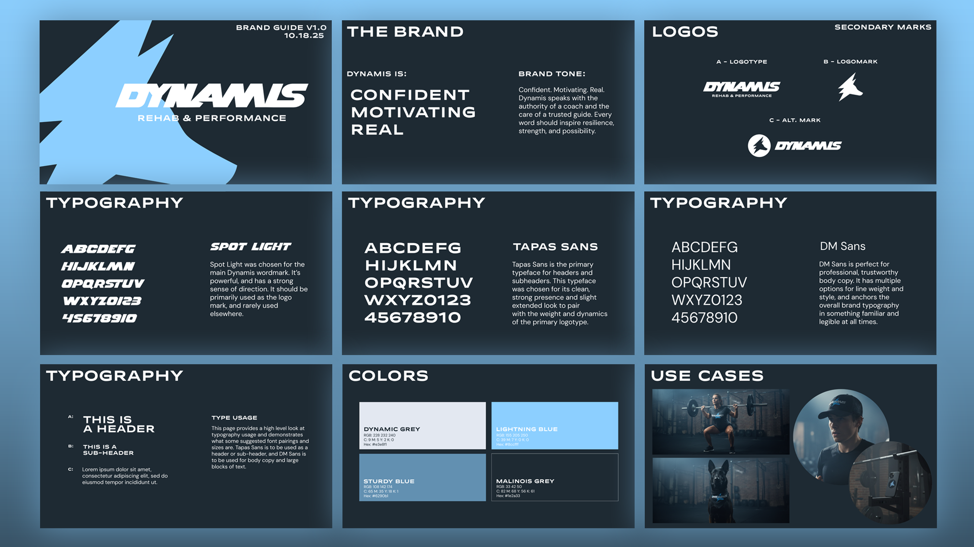
Health branding, especially in the physical therapy space, is bland. For an upstart PT, generic wasn’t gonna cut it. Bailey, the owner of Dynamis, wanted to stand out—and I was thrilled to help. Over a few weeks, we shaped the brand together, ending up with something vibrant and, dare we say, fun.
Process: Brand Nouns
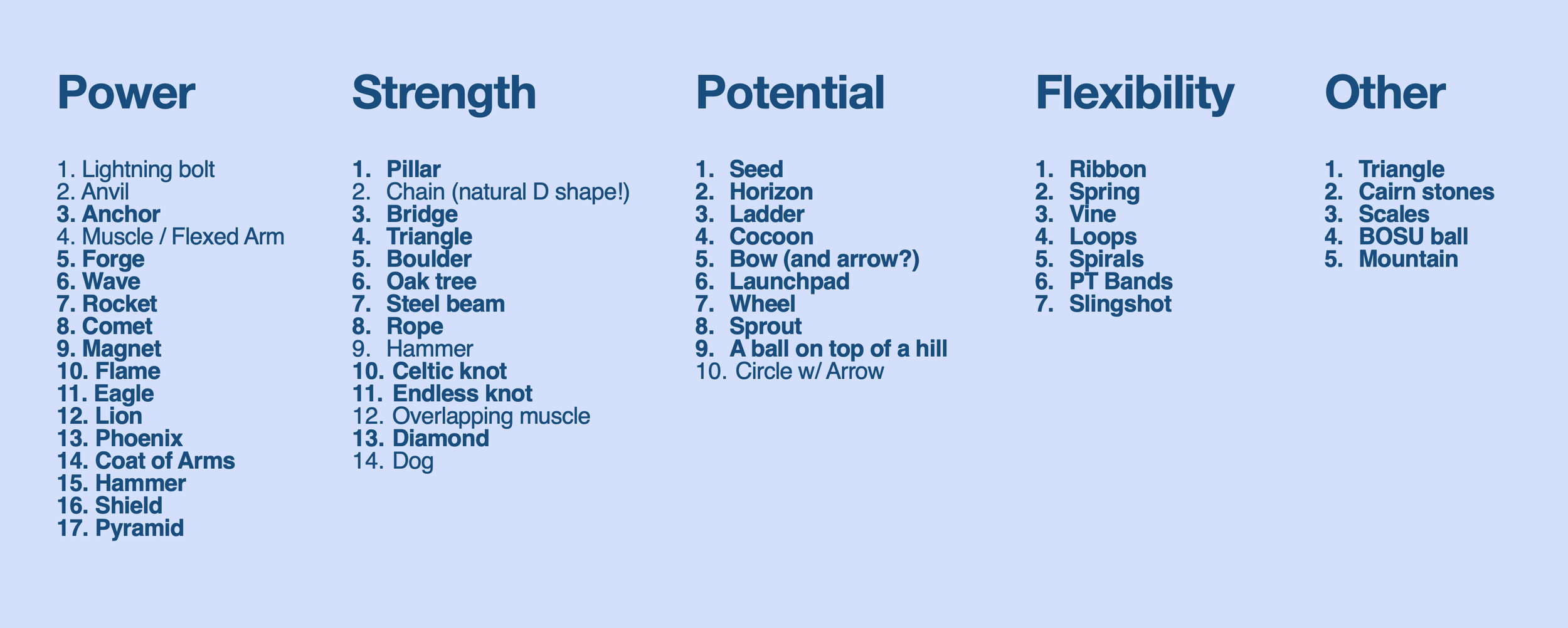
To ensure a close collaboration from the outset, Bailey and I worked to develop a set of Brand Nouns. We wanted the logo to convey power, strength, potential, and flexibility, so we made lengthy lists of related visual nouns to draw from.
POWER
STRENGTH
POTENTIAL
FLEXIBILITY
Process: Sketches
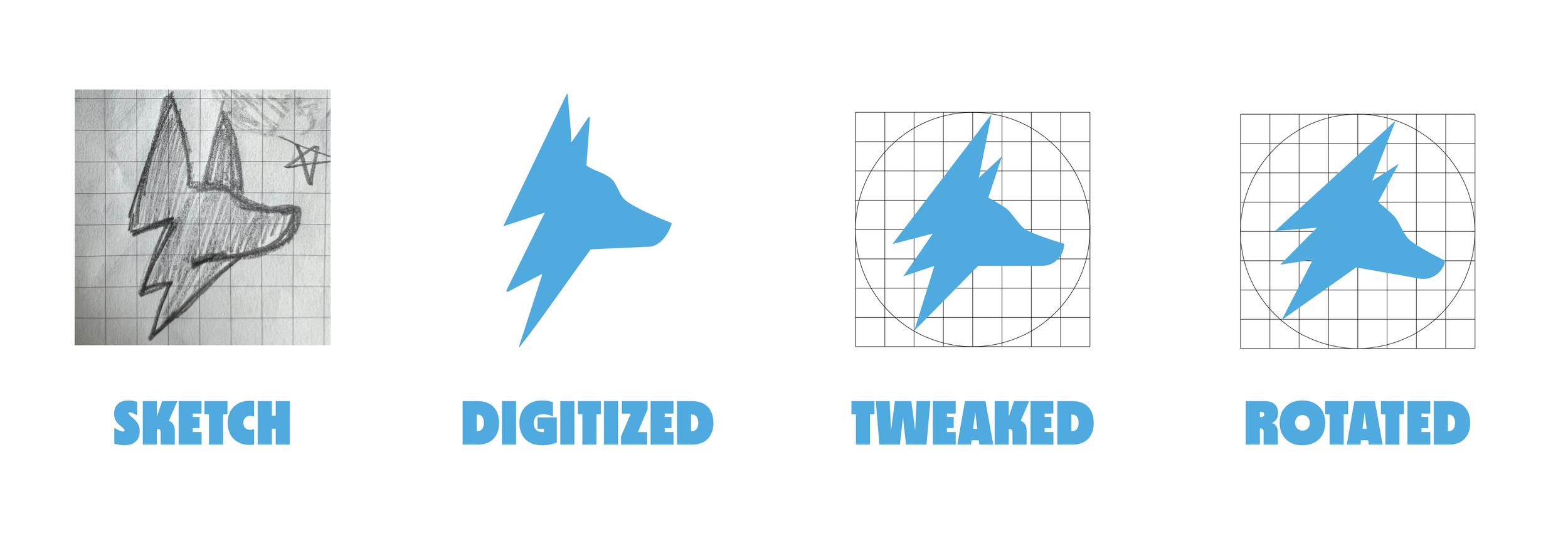
From our list of nouns, I got to work. I sketched a whole mess of ideas, good and terrible. But, that’s the beauty of it! Together, Bailey and I whittled down to our favorites. At the outset, she was drawn to a dog-based logo, as her Belgian Malinois Harvey is a regular attendee at her PT appointments.
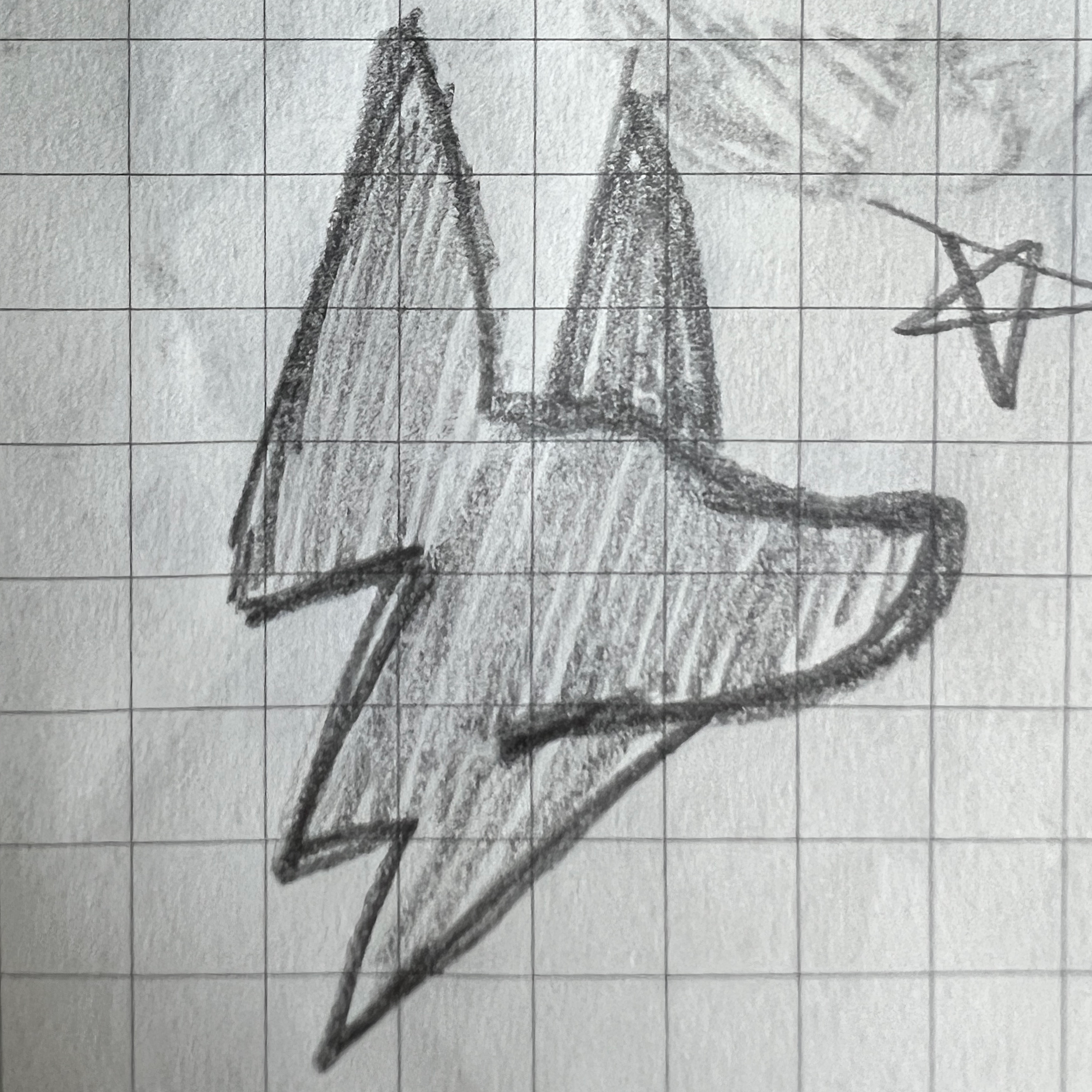
Process: Digitize Me, Cap’n
Once we’d settled on the main idea—a combo of Harvey and a lightning bolt—it was time to make it pretty. I re-drew it, cleaned it up in Illustrator and then made the biggest leap of all: a tiny rotation. Suddenly, our BoltDog had power and potential. It’s almost like the process works!
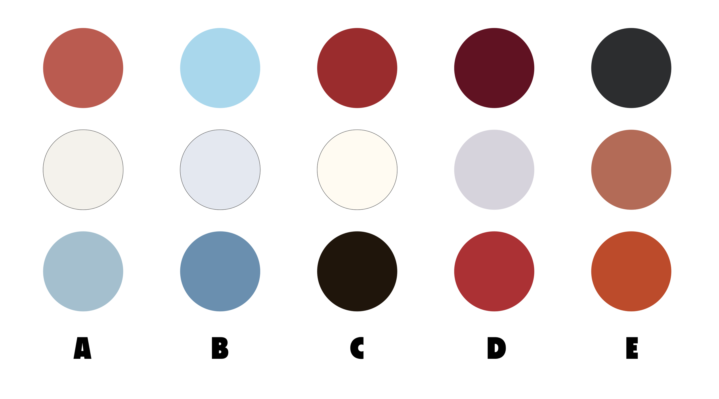
Process: Color
We had our logomark. Now, we needed to make it sing. Color is always a tricky part of the process. Everyone has a different association with colors, well beyond the deep pyschological associations we all apparently have. I, for one, am terrified of the color periwinkle. Must be evolutionary.
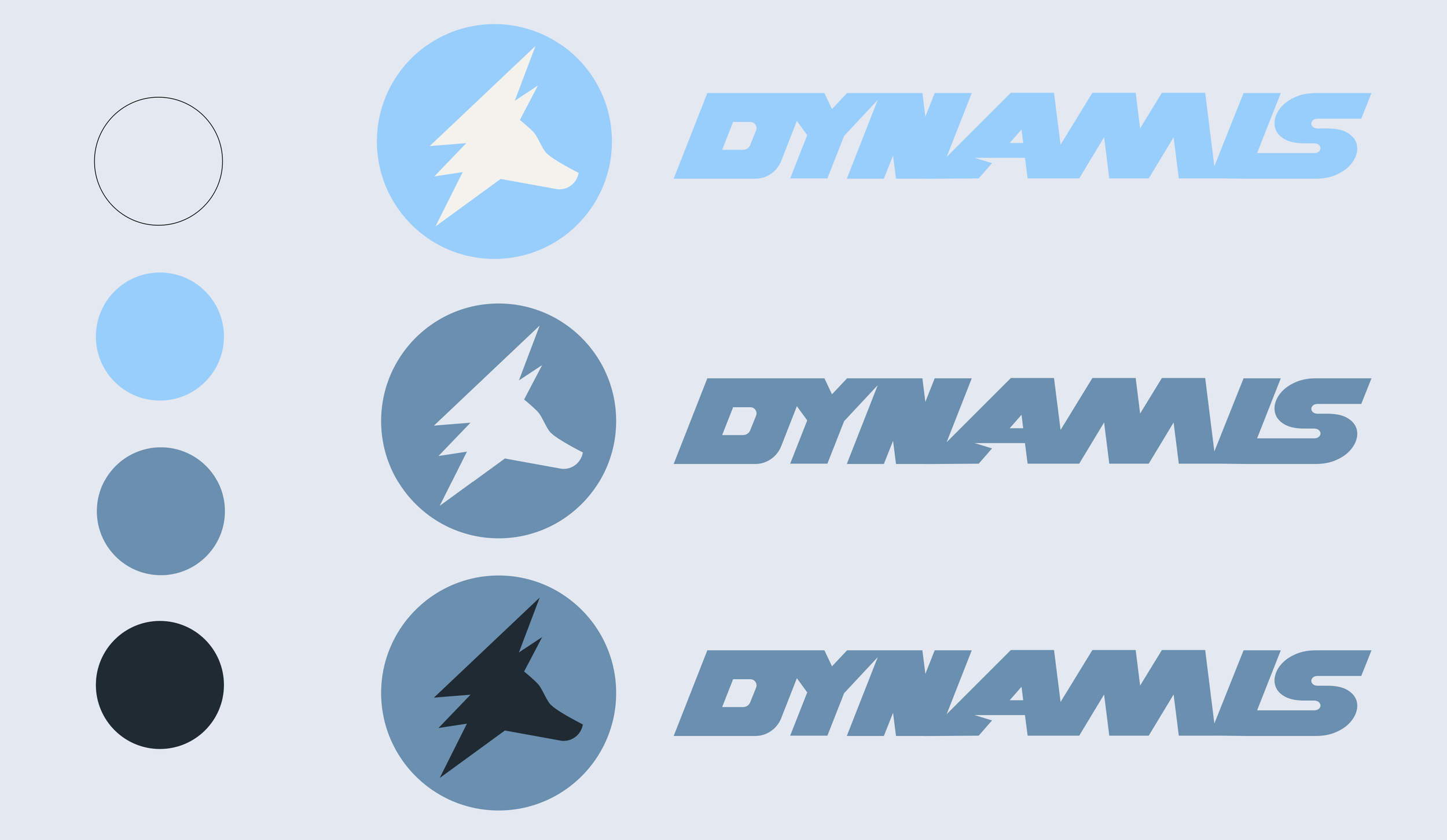
The Winner (+Wordmark!)
Bailey, a UNC grad, was drawn to lighter blues (I wonder why?!), so we went with a tweaked version of Palette B. Concurrently, I’d be exploring fonts to pair with our logo.
I landed on Spot Light almost immediately. I hemmed and hawed (professional term) about it for a full week because it felt too easy, you know?
But, after sharing it with Bailey, it was the clear winner. Sometimes the Muse hands you a hole-in-one!
The Result
All together, Dynamis Rehab & Performance was born. I built several lockups, a constrained color palette with fun names (can’t skimp on fun color names!), typographic standards, social pieces, and merch mockups. It’s all wrapped up nicely in a brand guide for Bailey to take with her as her business grows.